
Client: Emily Louange, Via The Village Timeframe: 3 weeks Role: UX designer/researcher Tools: Sketch, Axure, InVision
UX design and research
Via the Village is currently a digital nanny-share platform that connects families and nannies together to create affordable childcare options for users in their area. What began as a facebook group started by our client looking for childcare options herself, quickly grew into an opportunity to provide a solution for many parent users searching for childcare, and to many nanny users looking for employment opportunities. Inspired by the African proverb “ It takes a Village to raise a child,” the founder sought to create a space where parent and nanny users can connect to build their own personalized relationships within their local community, so they can find reliable childcare options through trusted connections. Not only does the platform provide an extensive nanny-share search, but it provides ways to build a childcare community. The website MVP launched April 2018 and the site has been successful amongst users ever since.
Challenge
The process for parents searching and matching with families and nannies online can be complex and overwhelming. Users need a way to seamlessly find suitable matches and build meaningful relationships. As a team of myself and two other UX designers, we were tasked with providing UX research and recommendations for the nanny-share platform to explore where value can be added to improve responsiveness within the user experience.
Solution
Through research, synthesis, testing, and prototyping we were able to identify opportunities to improve the platform’s usability and create a more seamless and intuitive experience for users. We wanted to design an intuitive dashboard experience that facilitates customized matches that result in more responsiveness from users to create meaningful matches and build relationships.

1.Understanding the problem
When we received the brief, we were excited to dive in and learn as much as we could about how families are meeting their childcare needs through creative solutions like a nanny-share. We were given a creative brief folder full of data of the current state of the product by the client, and we used that along with extensive domain research to better understand what exactly a nanny-share is and what opportunities are present in the current competitive landscape.
Domain Research
We learned that the main users are parents and nannies so we wanted to keep our objectives broad to identify opportunities that could benefit both users. As a team, we needed to have a mutual understanding of what a nanny-share is and analyze the full user journey for opportunities.

User Feedback Data
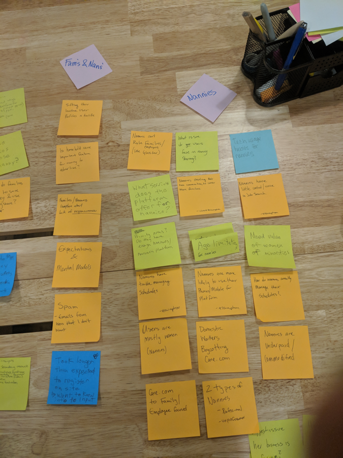
From the creative brief file we received, our team analyzed user feedback data from past surveys and polls done by users of the MVP site that helped give us a better idea of user goals and frustrations. Through our analysis of the data, we identified the top user pain-points into 3 groups to further explore opportunities to improve the user experience:
Filtering - Users expressed difficulty with dividing their time between viewing many different profiles and deciding which is the best match for their needs. If we look at ways for users to filter through searches and personalize their profiles, we could enhance the user experience.
Spamming - Users also expressed an issue with receiving unwanted or unrelated messages that result in feeling like they are receiving spam mail. Implementations can be made to the messaging system for users to better organize and manage their messages.
Ghosting - Some users felt there was a lack of responsiveness to their messages and at times had difficulty identifying if a profile was active or inactive to explain the missed communication, which results in users feeling ghosted or left alone. Messaging interactions can be further explored for opportunities to enhance the emotional journey users are experiencing.
Based on the user feedback data we assumed that users needed more personalization in their profiles to better achieve their goals. From our domain and user data analysis, we mapped out our questions and assumptions to confirm with the client. We assumed the best approach to enhancing the user experience would be by focusing on making meaningful connections between users. We held a kick-off meeting with the client to align our goals and expectations for the 3-week project and to validate our assumptions.

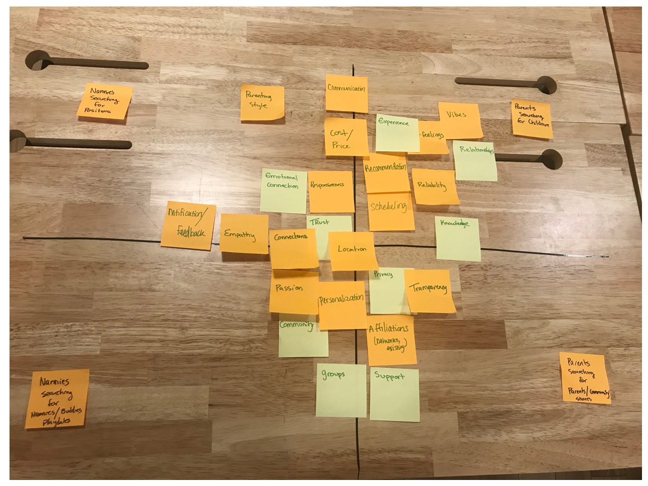
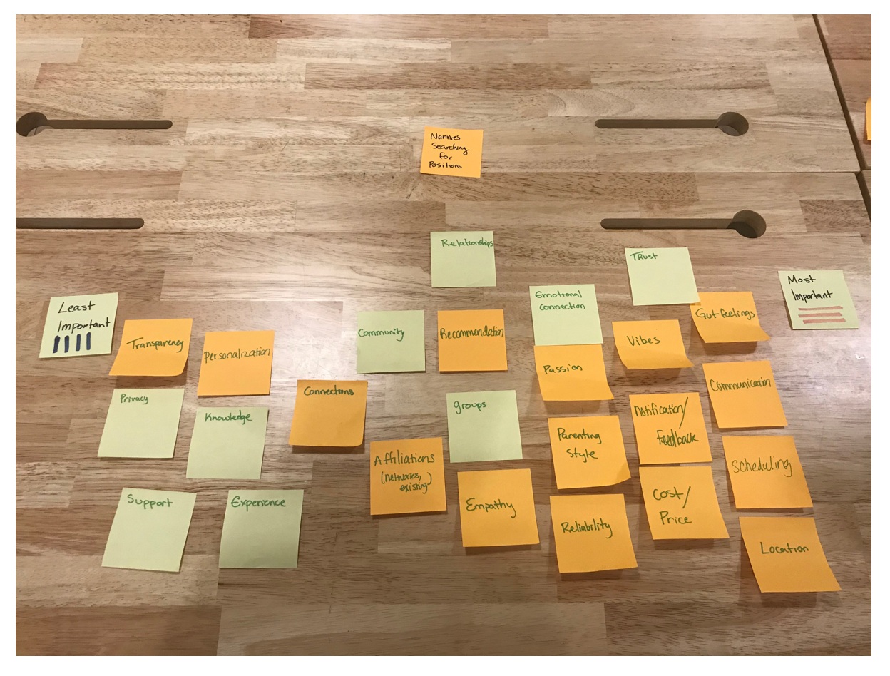
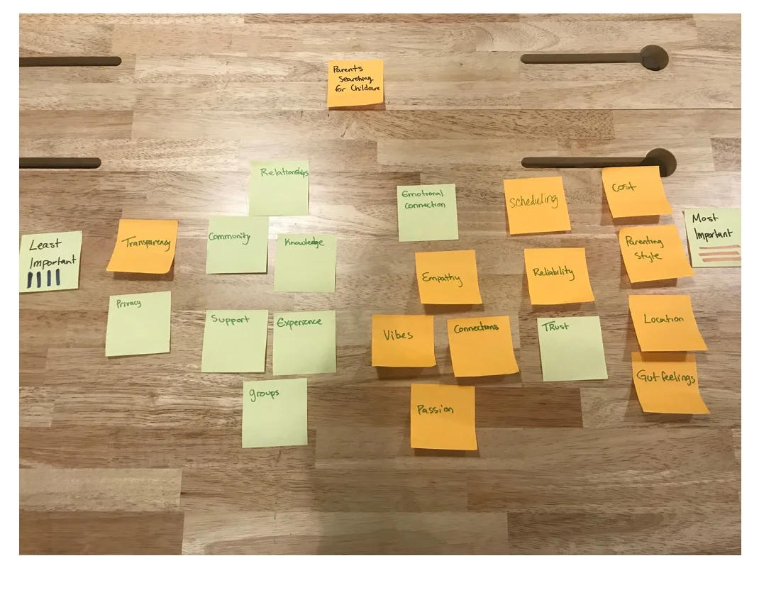
We mapped out trends from domain research and user data to visualize themes that would be the most important to guiding our scope.
We decided to use the kick-off meeting as a way to break the ice with our client and to identify product and business goals. To better understand the client's goals from a UX perspective, we developed a participatory design exercise where we had the client fill in the blank of a given user scenario:

Our takeaway from this exercise was the importance of creating meaningful connections and solving problems for both nanny and family users. We needed to identify opportunities for building connections as well as understand how these interactions were currently being facilitated. It was time to talk to some users.
2.User Interviews
To validate our research assumptions and to gain more perspective on the subject matter, we interviewed a diverse pool of subjects. We interviewed two subject matter experts, three nannies, and five parent users that were familiar with or had experience with a nanny-share. To get the most out of our users and make the most of our time, the interviews included introductory and background questions, then an exploratory probing questions phase, and finally with a short site walkthrough for us to observe user impressions.
Who we Interviewed:

Findings
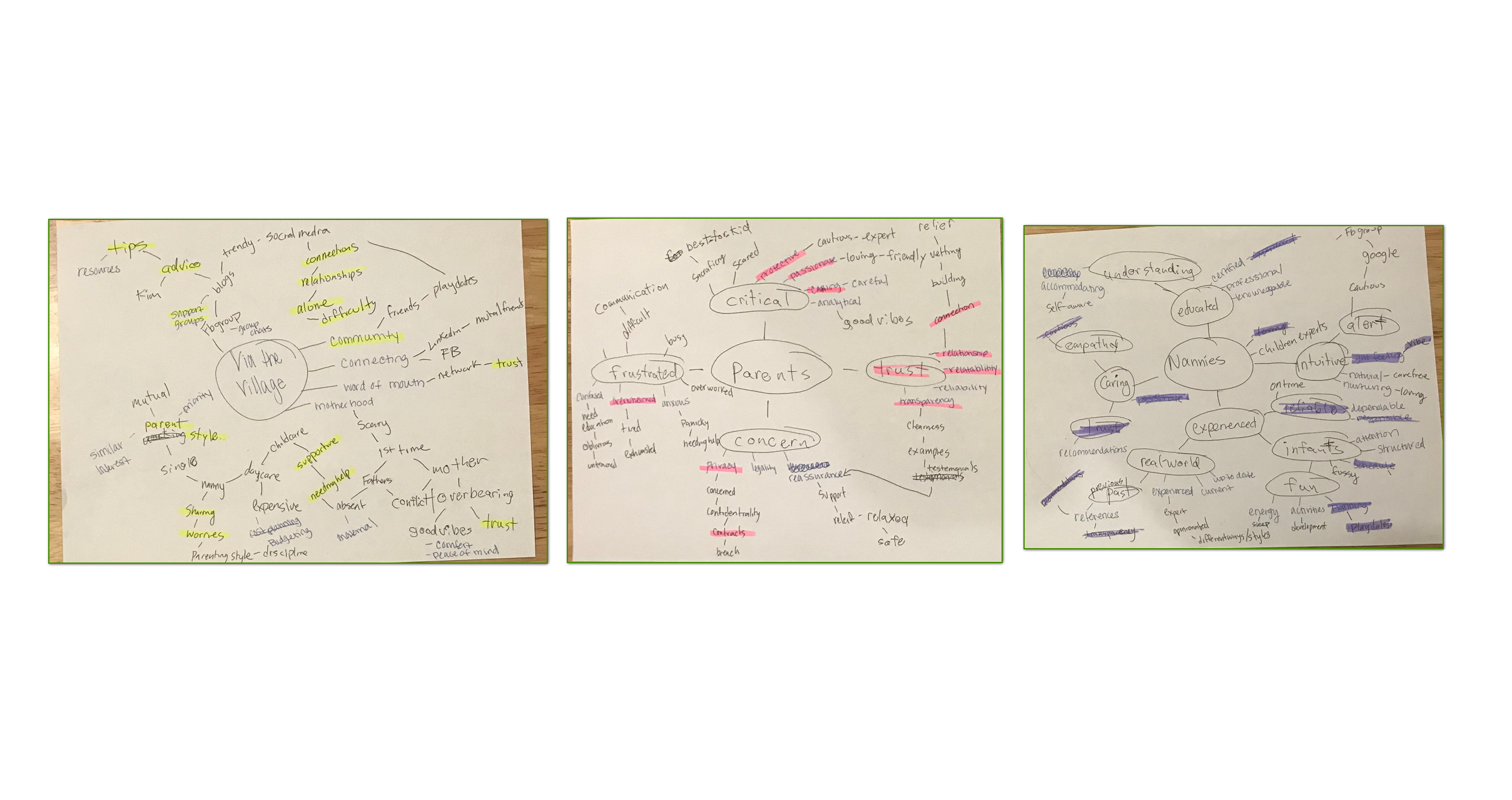
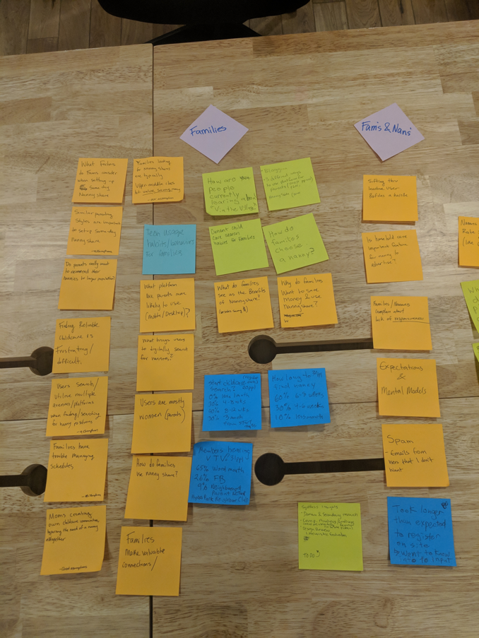
Mapping out key insights helped us identify overlapping themes within user goals as well as identify and prioritize what users value. We identified key user wants and needs for a more intuitive search and matching experiences from the interviews through affinity mapping and word mapping. By analyzing the site impressions our interview subjects had, we concluded that the best opportunity for enhancement would be to approach the onboarding process and the dashboard. Users want to spend less time vetting through profiles and more time matching to their personalized needs. They feel more secure when they can see relatable experiences and have access to credible information. Most importantly, they want a customizable experience with options for personalization. Through our analysis, we identified the top user goals as search, connect, community, and information. We used these 4 groups to further explore how these interactions were already being facilitated by direct and indirect competitors so that we could find opportunities in the marketplace for Via the Village.
3.competitive analysis
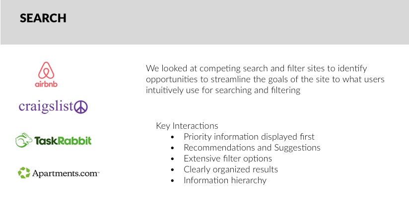
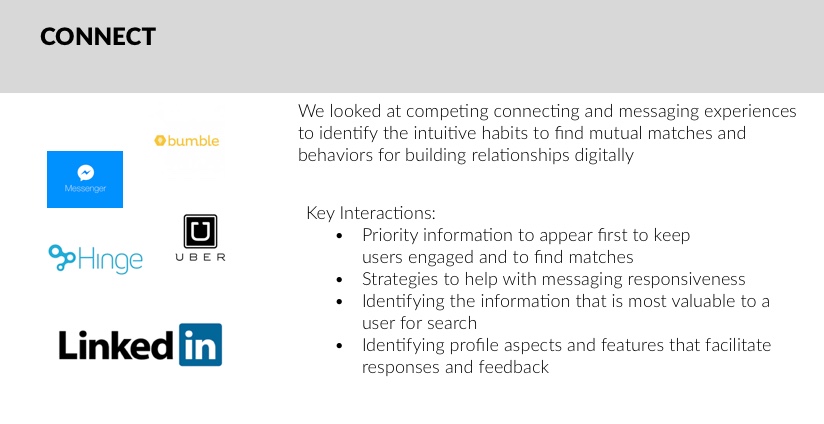
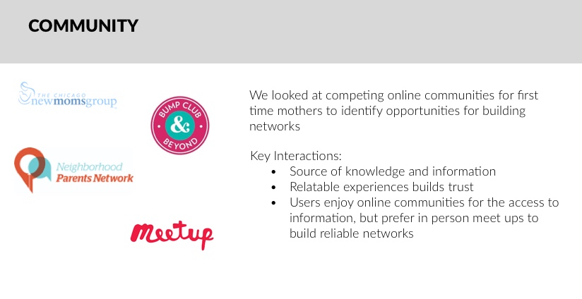
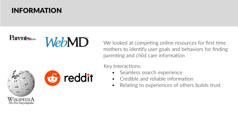
Now that we were aware of parent and nanny user needs and goals, we took a look at how direct competitors were facilitating those interactions. We then looked at indirect competitors that we categorized by the user goals we identified as search, connect, community, and information to better identify opportunities to enhance those engagements.
Direct Competitors Analysis:

Indirect Competitors Analysis:
Findings
At first, it seemed as if users wanted a lot of interactions and options according to our competitive analysis, but our user interviews confirmed that users were overwhelmed with too many features and too many options to sort through.
Looking at dating applications gave us a new perspective for connecting users. Similar to how dating app users are customizing their profiles to match for relationship compatibility, the nanny and parent users have to customize their request to match for a compatible relationship. We needed to further explore the nature of the user journey of parent and nanny users to prioritize their values to make a more personalized matching experience.
We determined that it was not the number of interactions and matches but the quality of those interactions being custom to the needs of the users. The vast amount of information can be a lot to sort through and make it difficult to find personalized content. We concluded that users must have to match their Personality, communication style, schedule, and location in order to make a meaningful connection.
4.Problem statement and design principles
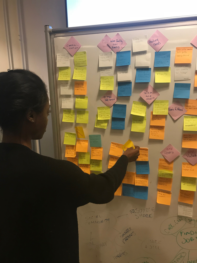
After finishing user research, we completed various exercises to synthesize the information we found to form a problem statement and design principles to guide our prototype design process.

Affinity mapping key insights.


Word mapping to see overlapping themes between the user needs and the goals of the website.

Synthesizing our user research insights to visually represent the hierarchy of what users value.
Problem Statement:
Parents and nannies need to share and connect on their core values and approaches to childcare in order to build beneficial professional and personal relationships.
1.Guiding Hand
Guiding and educating users at every step to promote themselves and support each other
2. Creating Balance
Balancing information delivery and relevancy while managing the complexity of interactions and relationships on the site
3.Human Touch
Encouraging respect, empathy, and thoughtfulness. Adding personality into the experience of digitally searching for childcare so that users trust the site and each other.
4.Meaningful Interactions
Making it simple to find people in your area that share complimentary values and interest. Eliminating the need to dig through hundreds of profiles and messages to find your perfect match
5.Mutual Friendship
Enabling good vibes /feelings of trust, through the connection between families, nannies, and their kids.
5. Divergent Concepts and testing
Following our research, we concluded that the best approach to making meaningful connections between users would be to personalize and customize the experience in a simple and intuitive way. We each developed a paper prototype of the dashboard of each concept. We chose to start with the dashboard after observing the site impressions from the users we interviewed and noticed that users spent the most time completing the onboarding and search process which both heavily involve the dashboard.
Divergent concepts:
Guidance
To provide more personality in profiles, we were influenced by Meetup, Airbnb, and hinge. The goal is to display a dashboard that helps guide/navigate the user experience and helps the user promote themselves better.

Management
To provide better matches we looked at Bumble, Instagram, and Facebook. The idea of this concept is to allow the user to manage multiple profiles to specific themes to facilitate up to date connections and weed out profiles.

Building
To encourage replies we looked at Hinge, LinkedIn, and Bumble. The goal of this concept is to support meaningful interactions that build a relationship between users.

Mixed usability/concept test
In order to get the most out of user testing in such a short time frame, we conducted a mixed usability concept test with 3 parent users and 3 nanny users. The test consisted of a card sorting exercise, usability test of the current state of the via the village site, then concluded with looking at paper concepts of possible dashboard experiences. The user observes all 9 sketches and we did not tell them the theme of the concept so we could identify which one was more intuitive to the user. The tests were completed in person and remotely using optimal card sort and video-conferencing software.
Card Sorting Exercise
We used optimal sort for the users to identify their core search values when looking for nanny-shares and childcare online. Earlier we identified that matching personality, communication style, schedule, and location as opportunities to provide connections based on specific customizable values. We intended to use the results from the optimal card sort to support our decision for prioritizing information in a way that best supports the user’s needs.

Via the Village current site usability test
We had the users navigate through the via the village site as it currently was in order to identify usability goals and frustrations. Users really enjoyed how clean and direct the site was but would get frustrated with customizing the search filter and navigating the messaging feature.
Paper concept test
Although we created the paper concepts with the themes of building, guidance, and management, we did not tell the users which theme they would be looking at so that it would not influence their impressions. We simply wanted the users to look at each concept separately and tell us what they think an action would do or should not do in order to observe what would be most intuitive and necessary for the client’s experience.
Findings

We concluded that the top features mentioned by users the most during testing were matching, search, messaging, and media; however, it was a divide amongst parent and nanny users. Search and media is more important to parent users while messaging and matching is more important to nanny users. We needed to prioritize the features and the users to avoid feature bloat and to stay focused on the MVP being a nanny-share search.
6.Concept Iteration
It was getting too complex to solve for two different users with one problem statement, so to keep the objectives of the users clear we identified parents as the primary user and nannies as the secondary user. We took a second look at the findings and data from our mixed usability test on our paper concepts to identify a different perspective to better understand the problem for a primary and secondary user instead of trying to solve the needs of both users through the same interactions. Based on our concept testing findings we concluded that message responsiveness would be the result of a more personalized onboarding experience and that nanny needs could be solved as a result of enhancing the parent's user journey. Similar to how a nanny-share works, we decided to focus on parent users in a way that nannies benefit as a result. We needed to reframe our thinking to focus on the specific needs of our users to avoid overwhelming the site with features.
We decided to complete more value matrices to prioritize the goals of the user as well as the site. In the midst of many maps and matrices, we had our aha moment, so we created a new problem statement that better identifies our users and their needs.
New Problem Statement:
Cost-conscious parents need a platform that centralizes the nanny-share process by connecting them to families and nannies that fit their lifestyle needs and personal values.
Through our research, we realized that the user need was more than building the relationship, but providing a simplistic experience that encourages relationship building. We felt the new problem statement allowed us to focus on the user goals as well as how Via the Village is central to the solution.
7.Final Prototype and testing
We converged our concepts that were used to develop the paper prototypes by combining the top mentioned features from our user test and produced a low fidelity prototype in Axure.


Final Wireframes
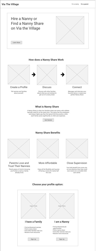
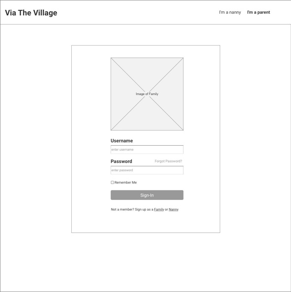
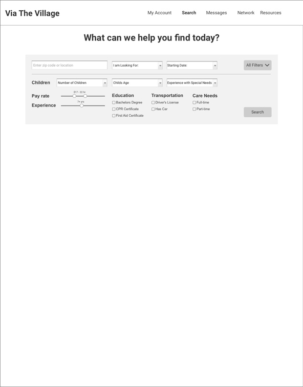
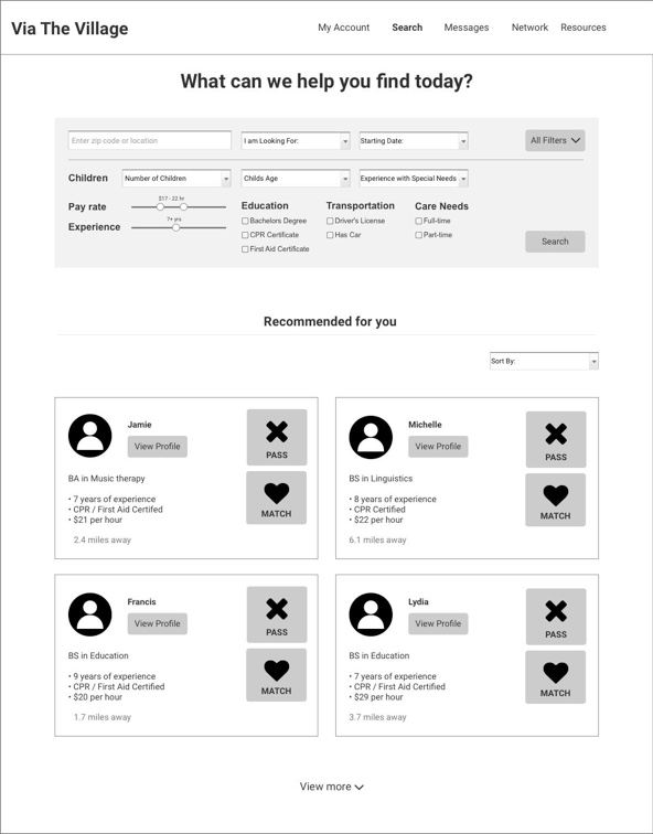
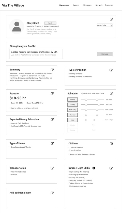
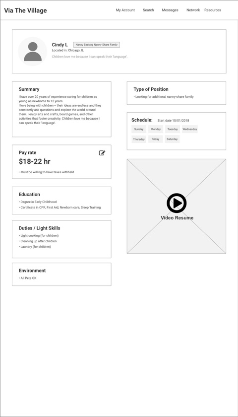
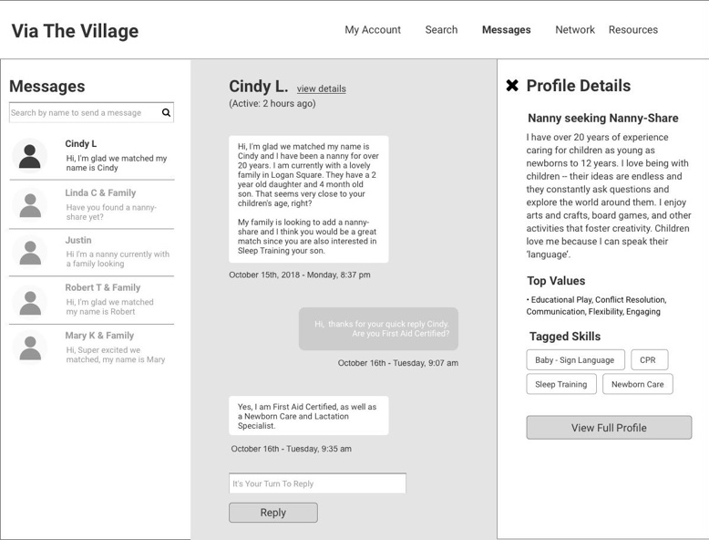
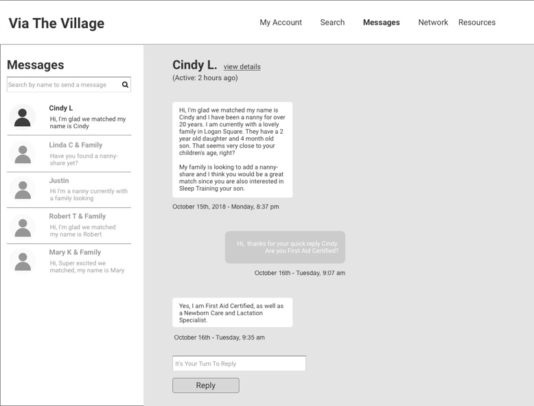
link to view full prototype: https://hg88pj.axshare.com/#g=1&p=home
Final Prototype testing
We requested through different online groups for parents that have or are currently looking for a nanny share to test our product. This way we would be testing with users that fit our specific target audience. We tested our final converged prototype on three parent users that were currently searching for a nanny-share. We assigned different user pathways as tasks for the users to complete with objectives for each task so we can gauge the effectiveness of the features and to identify how natural the user flow is. We had each parent walk us through how they would navigate the prototype to complete three different task scenarios.
The prototype tested well amongst the users. Overall the usability was more effective with personalized profiles and intuitive messaging flows with the matching feature being a favorite. The popularity of the matching feature brought up some concerns from the users that we found interesting such as the emotional journey for both parent and nanny users and how the effect of “passing” on a match would make the user feel. We feel that our findings support our recommendation to continue priority user testing to better assess new features moving forward.
Final Recommendations
From our usability testing and our collective UX research, we were able to develop future steps we think would help enhance the usability of the product moving forward:
Short term - By scaling back features and prioritizing the user flow to focus on a specific user, the site will be more effective. We recommend continuing priority user testing to truly determine the best pathway and features. Keep prioritizing the value proposition of the extensive nanny-share search to the primary user of cost-conscious parents.
Midterm - We feel a slow rollout of features will help prevent future feature bloat and be the most cost-effective strategy for our client. More UI testing should be done as well to determine a user intuitive layout. Once the parent user experience usability is more effective, Via the Village could implement more features targeted to the nanny experience. Different membership and subscription features could now be implemented as well.
Long-term - Once the target user base and funding is available, we feel Via the Village could implement more premium and complex features. Social media tested positively as a way for users to verify trust and build relationships so more social media integration and expansion can help create an intuitive user experience. More testing on the visual display and hierarchy to fit the needs of the target user group will enhance the usability of the site. We also feel more complex premium features could be implemented in the long term as well including video integration, timecard for shares, background checks, compare & rate applicants feature.
After 3 weeks of user research and concept testing we were able to provide the client with the following deliverables:
Research notes
Concept testing data and analysis
Usability testing data and analysis
Final wireframes with annotations
project reflection
1.Follow the research
This project started off very broad with a variety of directions that needed research and testing. In order to stay focused and develop a cohesive product within 3 weeks, we really needed to pay attention to what users and issues were most critical. I’ve learned through this project that modifying the design process to best fit the research and development goals may lead to a better product that truly fits the needs and wants of a user. When concepts and issues can get too complex, resorting back to the data and the research is the best strategy to find clarity and consistency.
2.Team alignment and communication
4 weeks is not a lot of time to build a relationship with new team members as well as building trust with a client simultaneously. Stepping out of my comfort zone of communication was challenging for me, but learning new ways to better communicate with a team was really rewarding. I am a very intuitive thinker and I work best by analyzing and synthesizing on my own then reconvening with a group; however, our schedule required us to work on a lot of things together to use our time effectively. I’ve learned to always make time to learn your teammates working styles and to be adaptable to fit the needs of the project.
3.Documentation and specification
From learning new communication strategies, I really found my love for documentation and specification within this project. My team was great at synthesizing user data and concepting ideas, but we struggled as a team to document the results effectively. I was able to try different documentation strategies that I’ve never used before and I feel it has helped me become stronger at identifying patterns and producing organized deliverables.
4.Making a difference makes me happy
I really enjoyed being able to look at a broad complex problem and creating solutions that make life easier for people. Seeing the reactions to different concept and ideas being taken positively by users and the client was not only rewarding but inspiring. It fed my curiosity and gave me more ideas to try in the future. I love how this project opened my eyes to wonder about an issue I may have never looked into and how its solutions can be applied to other areas.
Thank you for viewing my case study on the Via the Village Project!
Want to know more? Let’s chat or view my LinkedIn to get in touch with me.
More Case Studies